Sunday, December 26, 2004

oskar.


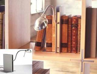
The Oskar is one of those "why didn't I think of it?" design ideas. It's a book light that's actually shaped like a book, made in fact to sit unobtrusively among books. It can even be used as a bookend, which is pretty nifty. (You can also use it as just a regular table lamp, but for me that doesn't hold much appeal.)

well. designed.
The Oskar is solidly built from aluminum plates, with the cord out the back and the on/off switch in the front. Again, perfect for sitting on your book shelf: The cord is hidden in the back, while the switch is easily accessible in the front. It uses a 50W halogen bulb which is a little on the bright side for my tastes, but it gets the job done.

but. wait.
I'd probably buy a dozen (well, at least 4-5) Oskars for my shelves if not for one problem...which I'll get to in a minute. But first, for those of you who complain about me when I complain about the price of something, here is your cue to stop reading: CUE: STOP READING NOW. For those of you who are still with me...for reasons I don't understand, the Oskar is $465. Not including the bulb, I might add!

design. within. what?
Okay, seriously, cool stuff is often expensive, but this seems excessive in the extreme, especially since it's so basic. And from a place calling itself Design Within Reach. Basic to the point where I'd expect to find the Oskar at IKEA for about $20. For $465, I could buy several bookcases and lights at IKEA and still have money left over for some books. Sheesh.

Friday, December 17, 2004

displayce.


Displayce is a brilliant idea for a multi-level table that changes its shape when you put things on it. In their words, "Displayce - From the definition of infuse: to introduce a thing into another, affecting it throughout. The Displayce table surface is broken into sections that begin level. After placing an object on one of the sections the others change in height reacting to the placed object's weight."

brilliant. but.
I think the concept is amazing, but the execution is -- literally -- uneven. From the picture it looks like a table was chunked up into squares, and each of those squares was put on top of some pretty wobbly springs, so this version doesn't hold together all that well. In my mind's eye, though, the perfect version of this is a table with a surface that looks uniform (i.e. not chunked up and wobble-ish) and then "displayces" in a smoother fashion. So designer Joel Hoag gets high marks for the idea and high hopes that he can pull it together in a working model that I can one day buy and misplayce my keys on.

Sunday, December 05, 2004

offcut. series.


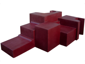
I'm not sure if this piece has a specific name or not, but it's part of the Offcut series by Beaudoir. The Offcut stuff is a line of oddly shaped foam furniture that looks like sculpture but is actually seating.

art. as. architecture.
I love furniture that's a cross between art and architecture because, even if you're not sitting on it, it's still a pleasure to look at. The drawback, of course, is that this type of furniture is generally not comfortable for everyday use, and this unnamed Offcut piece is no exception. It'd be great in the lobby of my hip Soho business (if I ever have one, that is), but I doubt it would get much use in my livingroom. I wouldn't mind seeing a non-foam, scaled down version as a coffee table, though. Hey Beaudoir, you listening?

buy. that?
So where can you buy this? No idea, although it definitely seems for sale. I just can't find a product or price list for it. Judging by the pictures on the Beaudoir site, you can get an Offcut in just about any color, which is a good thing because the weird chocolate-purple of this one is not the most appealing look I've come across. Pricing? No clue.

Wednesday, December 01, 2004

tatlin.


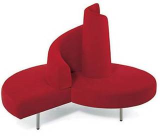
The Tatlin sofa is "freely inspired" by the famous Tatlin Tower, even though the tower was never actually built. If you're into architecture, at this point you're knowingly nodding your head in understanding. If you're like me, you're probably wondering what the heck a Tatlin Tower is.

sad. story.
The short, sad story of the tower is that a Russian named Vladimir Tatlin was hired around 1920 to create a Monument of the Third International. It was going to be 1,300 feet high and serve as an office building, a convention center and a few other things. It was sort of a spiral-ish, cylindrical affair that would rotate on its vertical axis and various geometrically shaped parts would spin around and occasionally meet up to connect the branches of government that were to be housed there. Needles to say...never built.

happy. story.
Happily, this "center stage sofa" was built, by Mario Cananzi and Roberto Semprini. In technical terms I'd describe it as a bold, funky, roundish affair that's actually quite comfortable. I imagine it's great at a party if you also have one of those circular conversation pits to put it in. The sales language has this take on it: "This is the first upholstered unit to go beyond the dimension of product and become a signal."

signal. price.
The price for this "signal" is about 4,200 euros, and I don't even want to contemplate what that would be in U.S. dollars. Actually, according to XE.com it's only $5,612.67. Not too bad!