Thursday, July 29, 2004

pony.


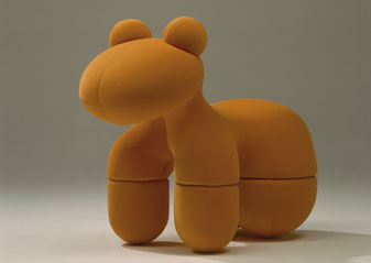
I don't think I can describe the Pony any better than creator Eero Aarnio already has: "A chair is a chair, is a chair, is a chair ... but a seat does not necessarily have to be a chair. It can be anything as it is ergonomically correct. A seat could even be a small and soft Pony on which you can 'ride' or sit sideways."

not. a. toy.
Aarnio maintains that the Pony is not a toy, at least not a toy for kids. To emphasize the point, he made it big. How big? Trust me, the thing is, like, big. Like, bigger than you think when you think "big" but not quite into "huge" territory. Big enough for a big kid like me anyway. Big enough that you better have a big room to put it in, too.

sitting.
As far as sitting on the Pony goes, I don't think that's going to happen too much. It's really more of a looking-at than a sitting-on piece. And honestly it's mostly a what-is-that? kind of piece. But those are certainly fun to have around. And the Pony is funner than most.

1973.
The original Pony was released in 1973, but Aarnio and ADELTA have teamed up to make a modern version. It's only for those with, like, big wallets though. The cheapest I've seen it is about $2,000. I guess I'm going to confine my looking-at to the store for now.
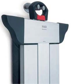
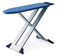
amleto. ironing. board.


I never thought I'd be blogging an ironing board on Funfurde, but (takes a deep breath) here I go: The Amleto is a seriously good-looking package. I won't say it makes ironing boards cool, but it comes as close as anything's ever going to.

style. elegance.
The Amleto looks pretty good when it's set up for ironing, and surprisingly it looks even better when it's hanging on the wall. The frame is made of anodized silver, which gives it a hip, stylish look, and the feet have been ingeniously shaped so they add a touch of elegance. When it's collapsed for storage, the feet bookend the top and bottom nicely, giving it a non-traditional (and dare I say "pleasing") ironing board look.


i. sort. of. want. one.
I like the Amleto so much I might actually leave it out not because I'm lazy (the usual reason I don't put ironing boards away) but because I like seeing it. And I'd buy one in a minute if it were reasonably priced and not $335. Yes, that's right, $335. For an ironing board. Sigh.

Tuesday, July 27, 2004

ecco. lamp.


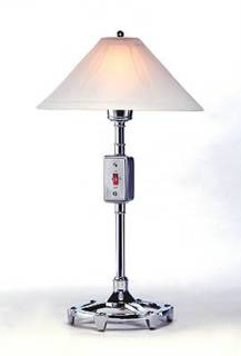
If you're looking for a table lamp that will fit into an industrial decor, you should be looking at the Ecco Lamp. From the chrome plating to the wall-style flip switch (illuminated, no less), this thing could have fallen out of the back of Monster Garage. Oh yeah, it has a dimmer too.

2 finishes. 50 watts.
If chrome is a bit over the top for you, you can soften the Ecco with a pewter finish, although I don't think that will make it blend into your Victorian sitting room more easily. It also comes with a sandblasted glass shade that helps to lessen the industrial feel, but honestly, why did the designers bother? I think some nice mesh -- or possibly barbed wired -- would have been better.

turn. on.
One of the reasons I like the Ecco is that it solves the problem I always have of not being able to find those little turny-type switches on most table lamps, the kind where you have to reach up under the shade to get at them. Hate those. For $179 you can eliminate that problem.

Monday, July 26, 2004

up 5. chair.


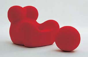
Chris, a Funfurde reader, pointed me to the UP 5 chair by B&B Italia. It's part of the UP2000 series, which is based on a design first unveiled by Gaetano Pesce in 1969. The UP2000 furniture is described as "a series of seven seatings of various dimensions, upholstered in a particular stretch fabric, whose anthropomorphic forms conserve intact, thirty years after their first appearance, the great visual impact which made them unique in time and throughout the world." Whoa.

mother's. lap.
I think what all that boils down to is: "Hey, this furniture looked pretty funky in 1969 and it still looks pretty funky today." Which it does. The UP 5 (pictured) seems to be the most interesting of the bunch. The description sure is: "a large mother's lap which reminds us of votive statues of prehistoric goddesses of fertility." Whoa again.

made. of.
The UP2000 series is made of polyurethane foam, and although I haven't had the chance to try out any of this stuff, I've personally never been too taken with foam furniture. I couldn't find pricing, but I'm sure it's the typical out-of-reach-for-mortals amount. Still, one can always dream. And dream about prehistoric goddesses to boot. Whoa.

Sunday, July 25, 2004

sheren-bett. expandable. bed.


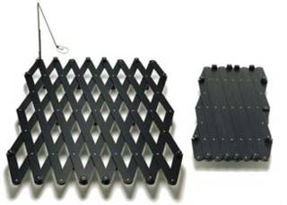
The Sheren-Bett Expandable Bed is neat solution if you're not quite sure what size bed you'll be using down the road, or you're not quite sure what mattress or mattress-like-thing you'll be using it with. (I've gone from a twin-size mattress to a large futon to a full queen mattress in my time, buying a different frame for each, so this is something that interests me.) Designer Daniel Thut made a bed frame that expands and contracts to suit any mattress size, so he's got you covered on that front. And if you don't like a mattress, it will support "a surface beside (sic) the mattress."

extras.
It looks like you can also buy a few bolt-on extras for the bed, like a side light (pictured) or a table piece that I saw here on MoCoLoco. I'm a sucker for bolt-on useful bits that come with beds, so I love these options.

hidden. beauty.
Besides the price (I saw it for a not inconsiderable $2,895 at Moss Online), the only thing I don't like about the Sheren Bett is that, when the mattress (or whatever) is on it, you can't see how cool it looks.

Wednesday, July 21, 2004

roma. mobile. work. unit.


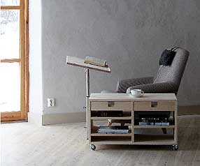
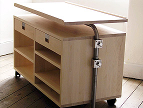
I don't draw much of a line between work space and living space anymore. It all sort of blends together, and I tend to look for furniture that blends too. The Roma Mobile Work Unit from G.A.D. does some pretty serious blending, and looks like something I might get a lot of use out of. The name needs a bit of work, though.


deskable? tablesk?
I can see why G.A.D. calls this a "unit," since it's not quite a table and not quite a desk, though it has a bit of both in its pedigree. (Tablesk? Deskable? Nah...) The two main features are a table top that can be extended and rotated to use as a work surface, and drawers that can be opened from either side (cool!). Combine those features with some good looks and wheels, and you've got a pretty handy furniture unit indeed.

unit. price
I didn't see a price for this on the G.A.D. site (admittedly, I didn't look very hard), but they do ship to other countries, so at least those of us in the U.S. have a hope of getting one.

Tuesday, July 20, 2004

lovely. rita. shelf.


You know that really cool long snaky Bookworm shelf that Ron Arad designed for Kartell? The one you always see in Real World houses? The one that costs way too much money? Well, this isn't that one. This is the other cool curvy shelf Arad designed for Kartell, called the Lovely Rita. It's sort of the same, but different.  The big difference is that this one's really really curved, not just kind of curved.

high. maintenance.
Rita and her curves are indeed lovely, but she's got a problem: Rita isn't much of a bookshelf. Or an anything shelf, for that matter. I've seen her in many stores, with many things shelved on her, and none of those things looked shelved very comfortably. Books mostly look like you caught them in the act of falling over. Vases look like they're about to crash down to the floor. This blog post from a Rita owner illustrates it pretty well.  I want books on shelves to look shelved, dammit, not piled.

crush.
For all her flaws, I still have a crush on Rita. I can't help it. I'm enamored of her looks. Now I just have to find the $225 it will cost to take her on a date.


Monday, July 19, 2004

phoenix. chair.


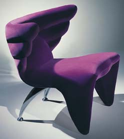
Hank Vu isn't kidding around. When Urbana's chief designer set out to make a chair "inspired by the flight of birds," he made sure you'd know it at first glance. And when he put wing-backs on this chair, he really put wing-backs on it. Behold the Phoenix.

on. the. wing.
I think the Phoenix is pretty self explanatory: See. Desire. Drool. Beyond its looks, though, it's worth talking about how the chair actually holds up when you're, you know, sitting on it and not just ogling it. I got to try a gorgeous two-tone model at Soma Sofa in San Francisco, and I can report that it's sweet for sitting. I don't mean sitting and reading for five hours, but I do mean sitting and chatting with your guests after dinner.

drink. lounge.
When sitting, you actually rest your arms on top of the wings, which are surprisingly comfortable. The reason I say I wouldn't read in it for hours is because the wings sweep so far forward that it's a bit confining. They're also too high to put your legs over. But if you want to lounge with a drink in your hand, it's perfect.

color. scheme.
It's pictured in purple but Urbana carries a lot of colors, some less funky and some more, so you can dress it up or down as needed. I happen to be in love with the Riflesso, which is a "high-end, high sheen 'modeling' crushed velvet." I don't know what that means, but it's damn comfortable and it looks amazing. Just like the rest of the chair.

Sunday, July 18, 2004

aga.


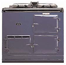
Racing Green.  You don't often hear that color when it comes to ovens.  But then again you don't often come across ovens as amazing as the Aga, which is available in a whopping 15 colors.   Take that Kenmoore, GE and all you other bland brands that think almond, white and black are the only colors kitchens should have.
 
iron. age.
The Aga doesn't just look different, it's also built different.   In fact, it's probably the only state-of-the-art kitchen appliance deliberately made of cast iron. How state of the art? Well, you never have to turn it on or off, or set the temperature.  It's always on and ready to use.  It does that by transferring heat efficiently from its core element to the built-in cast iron ovens. It seems that good old cast iron (surrounded by vermiculite) is so heat efficient, you can build an oven out of it that you never need to turn off.  Who knew?
 
cooking.
Cooking with an Aga is different, too, and Aga owners swear their food tastes better. That's because the heat from an Aga radiates from all sides of the cast iron ovens equally, not from one or two heating elements.   Supposedly this means your food will retain more of its flavor and texture as it cooks.  Of course, all food doesn't cook at the same temperature, which is why an Aga is actually made up of 2-6 small ovens, each of which maintains a different temperature.   If you want to broil something, just put it in the broil oven.  Same goes for baking, simmering, roasting, etc.
 
new. old. fashioned.
The look of an Aga is a "new old fashioned" flavor that foregoes sharp, angular lines and stainless steel.  While it's definitely easier to fit an Aga into an old-world or country style kitchen, with a little effort I think you can get it to look at home in a modern style kitchen too, since the lack of controls give it a streamlined appearance, and some of the color choices (purple, for instance) are decidedly new world. 


Friday, July 16, 2004

trek. coffee. table.


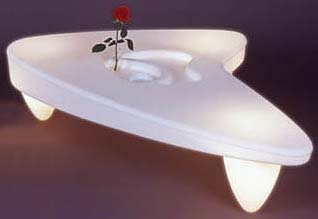
I'm not sure furniture gets more funky (or maybe hokey) than Trek, a light-up coffee table inspired by -- I'm not kidding -- Star Trek. The thing comes from Jet Net in France, where they also make a Galactica Chair,  a piece called Lunaar (that can be used as a chair, a table or a chandelier), and a few other products. Obviously they have a theme going on. Oh yeah, all of it lights up.
 
it. is. what. it. is.
I won't be putting a Trek in my house any time soon, but I'll give the designer points for doing what he set out to do.  The table clearly looks like it's based on Star Trek. If I'm not mistaken, it's made to resemble the little Starfleet symbol they all wore on their shirts. (I just outed myself as a closet geek there, I know.)
 
going. where. no... 
Don't surf away just yet, because it gets a little weirder.  The Trek can also go where no coffee table has gone before: your swimming pool.  As long as you take the light out first, supposedly it will float in your pool.   That makes it the first piece of furniture I've seen that's indoor/outdoor/amphibious.

priced. in. this. world.
Considering that it lights up and all, I'd expect the Trek to carry an out-of-this-world price, but at $399 it doesn't seem too bad. 

Thursday, July 15, 2004

turnaround. chair.


The only thing that moves on the Turnaround Chair is the backrest, which swivels freely through 360 degrees.  What possible good could that do anyone?  Let me tell you...
 
front. to. back.
You know That Guy who always sits in the chair the wrong way, draping his arms over the back?  Hint: In the office he's the overgrown, obnoxious frat boy.  In the movies, he's usually the bad guy (who often assumes this position while gloating over the captive good guy).  This chair was made for That Guy. 
 
galoot. decorum.
Normally it's not considered polite to sit in a chair back-asswards, but That Guy won't have to worry about getting on the wrong side of Miss Manners as long as he's sitting that way in the Turnaround Chair.  It's what he's supposed to do.  They even made the backrest so it doubles as an armrest, so That Guy won't look too galootish when he does it.
 
okay. really.
Okay, maybe the chair wasn't made specifically for That Guy, even if it is well suited to him. Officially the manufacturer, Nienkamper, created the chair for "settings where people interact and socialize, such as meeting and breakout rooms, cafeterias and waiting areas."  I.e., it's not a 9-5 seat, but it is a fun seat.
 
paying. for. it.
Since That Guy will probably end up sitting in the Turnaround Chair, get him to help pay for it.  It starts around $1,100.

Wednesday, July 14, 2004

pablo. vase.


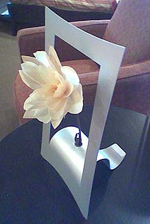
Flower vases and pictures have always had a strange relationship, mostly because people feel compelled to paint endless pictures of flower vases. The Pablo Vase combines the two so that the vase is the picture, and vice versa. Brilliant.

picture. this.
What really makes this vase work for me is that it plays with my sense of dimensionality. My mind sees "picture frame" and thinks 2-D, but it's really 3-D. My mind also sees "flower" and thinks 3-D, but then it sees picture frame and starts leaning back toward 2-D again. The end results is invariably a smile. (The 2-D/3-D effect is more striking when you see the Pablo Vase head on, instead of angled as in this picture.)

good. bad. news.
The good news is the Pablo Vase is pretty inexpensive at about $20 (correction: $45) per frame...er vase. The bad news is I haven't been able to find it for sale online. Searching for anything like "Pablo Vase" has been a bit hopeless because of that famous artist guy. I saw this one at Kasala in Seattle (photo take with Nokia 3650 camera phone). If you've seen one online, let me know.

Note: It sure looks and sounds like a Pablo product, but I can't find it on their site.

Note2: Lorena wrote in to tell me that Shopdevidence.com has them. Thanks Lorena!

Tuesday, July 13, 2004

fj-57


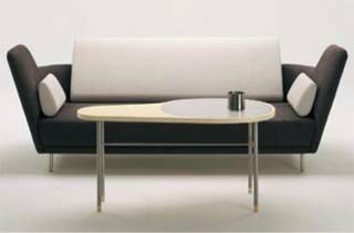
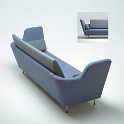
The FJ-57 sounds more like an XPrize contestant than a sofa, but a sofa it is. I think the full name is "Sofa Model 57" by Finn Juhl, but FJ-57 seems to be its popular abbreviation. Finn, by the way, was an award-winning furniture creator, architect and a father of sorts to Danish design. I didn't know any of that when I saw the FJ-57, I just thought it looked different and cool. But I can see why he got all those awards.

cool. comfort.
The problem with different and cool sofas is that they often turn out to be uncomfortable and expensive, but the FJ-57 is just fine for everyday sitting and stretching. Part of that is due to the curved back, which makes it easy – inviting even – to sink into. The other part seems to be good design and material. Again, I see why Finn got awards (and lots of them).


two. tone.
The FJ-57 isn't super funky looking, but it's well suited to a two-tone look that can add a bit of dash if you’re looking for it. Finn really thought this one through.

price.
Unfortunately the expensive part is true. At Egbert's in Seattle the FJ-57 was running a bit over $6,000. I hope Finn's heirs get royalties…

Monday, July 12, 2004

radical. radiators.


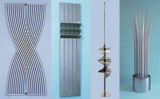
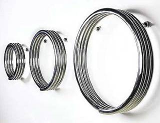
I used to think radiators were crappy, unsightly relics of Victorian era plumbing that had to be hidden away at all costs. If I'd known they made them this cool (er, hot) looking, I wouldn't have been so quick to buy a house with central air. Seriously, these things are outrageous, and Bisque carries way more than I have pictured here. And, yes, by "radiator" I do mean those things that heat your house. You may be confused looking at the pictures, wondering if I meant to say "metal sculptures" instead of "radiators."

six. feet. over.
A lot of these are over six feet tall, so you'll need to dedicate quite a bit of room to them. Most are made to be hooked into central heating systems, but some have stand-alone electric versions as well. (The Power Plant -- the tall spiky plant-like one -- is only available in an electric version.)


hot. prices.
The prices are probably too hot for most homeowners, though. The ones I found are from the U.K. and range from hundreds to thousands of pounds. At current exchange rates that means some of them cost more (a lot more) than some cars I've owned. Of course, the cars didn't look this good...

Sunday, July 11, 2004

word. clock.


When I think about what time it is, I usually think in relative terms, not the absolute numbers most clocks use. If it's almost twelve o'clock, for instance, I usually think something cunning like, "It's almost twelve o'clock." I don't usually think "It's 11:57:02."

dutch. architects.
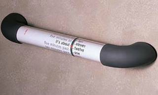
Apparently some Dutch architects think the same way I do, which is why they invented the Word Clock. The clock doesn't use numerical notation to show you what time it is, it uses ... words. With the Word Clock, 11:55 becomes "Five minutes to twelve." And 11:57:02 becomes "It's about twelve."

no. hands.
A clock with no numbers might not be such a big deal, but this one also does without those old timepiece mainstays, the clock hands. And while designers Muller and van Dongen were at it, they ditched the typical square or circle designs of most clocks and instead went with a cylinder. As the two parts of the cylinder rotate, the number words ("three," "seven," "twelve," etc.) line up with the appropriate phrases ("ten minutes past," "five minutes to," etc.) to tell you the time.

time. for. options.
You can get the Word Clock in a bunch of languages, like Japanese, English, French and, of course, Dutch. You can also get it in different sizes, such as 21" long or 33" long. And you even have options when it comes to placement, since it will work on both horizontal and vertical surfaces.

hot. tip.
A place called Lifestyle Fascination is selling the 21" version for $50 less than the list price.

eva. solo. grill.


Over on the Dwell bulletin board they're discussing modern outdoor barbecues, and the pickings are slim indeed. It's obvious that grill makers have a long way to go when it comes to innovative design. There is a diamond in the rough, though, and it's called the Eva Solo Grill.

solo. style.
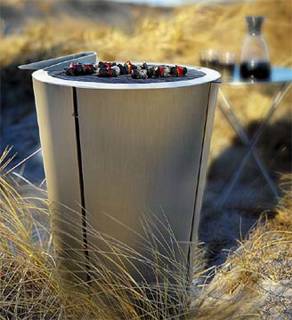
The Eva Solo is a gorgeous piece of stainless steel cooking art that doubles as a gorgeous mod-looking outdoor table thanks to a flat top design and a flat lid. When the grill isn't in use, you put the lid on top and you have a table. When the grill is in use, you use the included tripod legs to turn the lid into...a table.

great. grill.
This grill is more than just the sum of its lid, though. It's also a grill that works the way most do: set some charcoal in it, then set the charcoal on fire and you're off and running. In the Eva Solo the charcoal sits in a removable bucket that makes clean up easier. You can also add an optional cooking dome and matching "tweezers" (i.e. tongs), plus a zip-up fabric cover.

what. cost?
As usual good design will cost you, to the tune of $450 for the Eva Solo. The good news is that price seems to include free shipping at most online retailers.

Friday, July 09, 2004

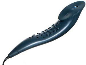
ola. phone.


I was browsing the Funky Phone Company and came across this awesomely organic design by Philippe Starck. Called the OLA, it grew out of his desire to "make a telephone which was no more than an extension of the human limb."

human?
Although I love the phone, I have to point out that it doesn't look much like an extension of a human arm. Maybe an alien arm, or a body part from a Cronenberg film.

standard. functions.
While the design is unusual, the phone itself operates in the usual fashion. It has things like mute, redial, memory dialing and so on. The color choices, however, are weirdly limited to dark grey, light grey and mint green.

france. phone.
The OLA was designed for the French company Thompson and comes with European wiring, but you can buy it with a U.S. adaptor kit from the stores that sell it (which are precious few, as it's no longer in production).

Thursday, July 08, 2004

all. around. couch.


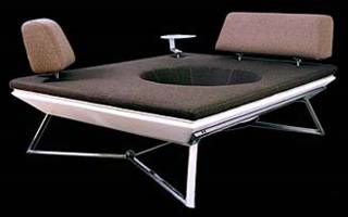
The philosophy behind the All Around Couch from Dnsign is "to meet." In this case you literally won't be able to avoid the person sitting next to you, because you sit in/around a big hole. Once you're in, you're in. And so is anyone who's brave enough to join you. Plan on getting to know them well.

accessorize.
You can accessorize the couch with back rests and a small glass table. They're interchangeable and rearrangeable, which may come in handy when you want to get out of the All Around.

unique. look.
Dnsign has succeeded in a creating a unique piece of furniture, and I'm not even sure it can rightly be called a "couch." The look is all over the map: part car seat, part trampoline, part ... other stuff. If you're looking for something different, this should do it for you.

Wednesday, July 07, 2004

KLOC. floor. lounger


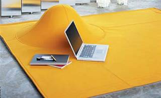
The KLOC Floor Lounger from Ligne Roset is basically a padded rug with a built-in hump. If you're thinking, "There must be more to it than that" then you're thinking too hard. Rug. Hump. That's all you get.

what. good. is. it?
If you're thinking, "What good is a rug with a hump in it?" I can't say I blame you. But it does have a few things going for it. First off, it's a pretty nice rug. It's made of felt covered in a wool fabric, and it comes in a bunch of colors. Basically, it looks kind of cool and it's got a great texture. It is, in fact, great for lounging on.

okay. but.
The hump is a bit weird, I admit. Ligne Roset calls it an "integrated dome for head and shoulder support" but I've tried it and, honestly, it's not all that much fun to put your head and shoulders against. You can, however, lean against it and get some needed lower-back support from time to time, which makes it perfect for two things: video games and Web surfing.

any. position.
When you just want to lie around and surf the Web on your wireless laptop, everyday rugs and carpets won't do for very long. But the KLOC excels in this area. It basically lets you get comfortable in any position you want: sitting up a bit, lying down, on your back, on your stomach, curled on your side, etc. Just not with your head lying directly against the hump. In fact, the only way they could make the KLOC better for surfing and/or gaming is if they tucked a wireless node and an Xbox in the hump. (I have no idea what the hump is made of, by the way.)

Tuesday, July 06, 2004

hag. pantonic. chair.


Xeni over at BoingBoing told me about her other Web site, Ambience Dore, where I found the Hag Pantonic chair. This is another one of those chairs that has "dynamic ergonomics," which means the chair moves when you do, and that’s supposed to be good for you. Read on.

what. hag. says.
"An ergonomic chair is a chair that naturally follows you as you move to the next sitting position. It must obey the minor and major movements of the body and be at rest when the body requires it. When the chair follows the body it means you can concentrate on your work, at the same time as the body gets the appropriate nourishment for the active muscles. You are moving your entire body without being aware of it."

what. i. say.
Looks-wise this chair had me at "hello." Hag says you’ll smile when you see it, and they’re right. I did. And still do. But it doesn’t strike me as a sit-in-it-all-day kind of chair, no matter how much it "follows" me. I say, get a bunch and put them in your meeting rooms at work. That's a place that tends to need a little fun.

if. you. have. to. ask.
It was hard finding pricing for these, but they seem to run about $400 per chair. That's another good reason to get work to pay for it.

Monday, July 05, 2004

droog. laundry. basket.


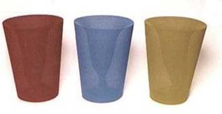
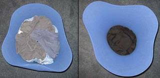
Dirty laundry is uninteresting and unsightly, and watching it pile up tends to be unsettling. Unless you have a Droog laundry basket. Then dirty laundry is simply a catalyst for an ever-changing work of art. The more laundry you throw in the Droog, the more changes you'll see.

plastic. fabric.
The basket is basically a thin sheet of plastic rolled up in a cone shape, with a piece of knit fabric that goes around the outside then dangles on the inside (look at the picture...it will help make sense of that description). The dangly bit is what holds your clothes. When it's empty, the laundry basket has a uniform, cylindrical look. As you fill it with clothes, it changes shape. Throw in a sock and you might see the dangly part bulge a bit. Throw in something heavy, like jeans, and suddenly the cylindrical body will morph into a three-leaf clover shape as it adjusts to absorb the load.

flimsy. but. sturdy.
The laundry basket needs to be flimsy in order to flex, but not so flimsy and flexible that it will just collapse. The Droog walks a fine line here, but walks it well. When I first put it together (it has instructions, but they're short and simple), I didn't think it would be able to stand on its own, let alone hold clothes. Stand it did...but just. Surprisingly, the more clothes I put in it, the more stable it seems to become.


it. really. works.
I thought the Droog would be pretty gimmicky, but I hate laundry so much that I was willing to shell out $60 to try it. The money was well spent, because the Droog works as advertised. It seems to default to a few basic shapes depending on the weight of what's in it, with the three-leaf clover being most typical. But it's fun to see what it will do next. You can see two test batches of (clean) clothes I used in the second photo. (Photos were taken from directly overhead so you can see the changes more clearly.)

hot. tip.
Throw your clothes so they hang part way out of the basket if you want to see some of the more unusual shapes the Droog can take on.

Sunday, July 04, 2004

desk. #230.


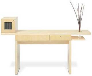
Rhoom is a Los Angeles based designer and manufacturer that advocates simplicity and functionality. I guess that's why this piece is simply and functionally called "Desk #230." Anything else you need to know, you can find on the Web site. Well, almost.

the. desk.
The #230 manages to be bold and minimalist at the same time. Bold because the designer chose to balance a built-in flower vase on the right with a small top-mounted cabinet on the left. (And mounted flush with the front of the desk, to boot.) Minimalist because, aside from those features, there's only a drawer to distinguish this piece. It's also relatively minimal in size, at 64" wide, 12" deep and 30" high.

enough. rhoom?
Unless the #230 comes with a keyboard drawer, I don't think many people will be able to get a computer situated usefully on this desk. Twelve inches doesn't seem like enough room (or Rhoom) to get a keyboard and a display on. But it still makes an awesome writing desk.

too. minimal.
I think the Rhoom Web site is a little too minimal, because I can't find pricing on it. There is contact info, though, so you can get in touch with them if you're interested.

Thursday, July 01, 2004

predicta. chalet.


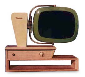
Telstar has been making noise recently with their Predicta TV line, and deservedly so. I'm in love with the in-development Chalet model, which is described as "a tribute to the great American Icon, the Drive-In Theater." What's particularly cool about the Chalet is that the 18" color picture tube can be tilted up and down, and also turned right or left, so you can make sure the screen is just-so for any seat in the house.

classic. lines.
These new Predicta TVs are based on the original Philco Predicta, manufactured from 1958-1960. Those are collector's items now, which is to say hard to find, expensive, and difficult to maintain. The new Predictas come with modern electronic guts, so they retain the classic lines of the original but not the classic problems.

size. no. hdtv.
Although the new Predictas will work with modern day equipment like satellite TV and VCRs (mercifully they have remotes, too), there isn't an HDTV model at the moment, and the sizes are limited to 18" and 24". So if you've had your eye on a 42" flat panel display, I doubt you'll find these sets compelling.

price
The Predicta Web site doesn't list prices, but does say the new TVs cost less than the 1958 version (indexed for inflation). It also says they are "not priced with the cheapest TVs you can find." It further says they are "priced to be comparable with the average high-end TV you would find in your local TV store." In other words, you need to have been putting aside money since 1958 if you want one.

(Note: See comment below for pricing info from a reader.)