Monday, August 30, 2004

after. hours.


The After Hours by Roz Hayes and Dani Stoller is a giant sofa that's also a lounge. At first I thought they meant "lounge" as in a big sofa, but then I realized they meant "lounge" as in a room where people hang out and, you know, lounge around.

room. with. a. view.
Well, maybe not "room" per se but certainly room-like. I mean, it's got walls and a ceiling, plus built-in lights, and it even has an optional acrylic back window. It's about as close to a room as you can get without actually being a room.

room. sized. price.
I'm used to funky furniture being expensive, but the $13,800 price tag for the After Hours has even me gasping. I now realize "After Hours" doesn't mean a lounging room, it means you'll have to take a second job after hours if you want to buy it.

free. gmail. invites.

Gmail just gave me six more invites that I'm going to pass on to Funfurde readers. If you're interested, reply to this thread with your e-mail address. First come, first serve.

Sunday, August 29, 2004

the. tube. lamp.


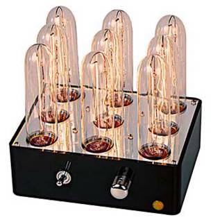
I love this modern lamp made from retro tubes. How great is it? So great that it has its own Web site. The fact that creator Nik Willmore says it was "nerdily conceived" is just an extra bonus.

showcase.
The lamp is made of 9 so-called "showcase" bulbs controlled by a dimmer. They're called "showcase" because they're used in store displays and picture frame lights. Of course they are. You can buy replacements at Home Depot, but Nik says they typically don't burn out, so don't stress about that.

telecaster.
Cool feature: The dimmer is a knob taken from a Fender Telecaster electric guitar. The box itself is made from bakelite, and the top is a mirror. The maximum power is 200 watts, while the maximum price is $275. Right now you can get them for $225, though.

Thursday, August 26, 2004

disney. faucet.


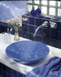
I'll be the first to admit I'm not a big Disney fan, but when I came across this Disney bathroom paraphernalia on the Kohler site, it made me smile.

subtle.
What most impressed me about the Disney Collection is that it doesn't scream DISNEY! at me the way a lot of their stuff does. I mean, 4.5 seconds in a Disney store is enough to drive me insane. But I think the Disney faucet, with its cut-out Mickey ear, is absolutely elegant. And the mouse ears in the sink blend in beautifully with the bubbles. And it's a vessel sink, my absolute favorite kind.


toweling. off.
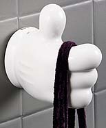
Well, two out of three ain't bad. The collection also includes a towel rack, paper holder and robe hanger (i.e. hook), all made out of ceramic Mickey hands. These are rather on the garish side. Which is to say, they make me want to rip them out of the wall. But I'm pretending they don't exist.


eisner's. cut.
Of course this is Disney, and that means Michael Eisner gets a cut of everything you buy. In this case it's $575 for the sink and $447 for the faucet. At those prices, you could save money and just take a trip to Disneyland.

Wednesday, August 25, 2004

flipper.


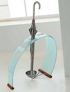
I didn't know I wanted an umbrella stand until I found the Flipper. Let me clarify here: I don't need an umbrella stand. I only own one umbrella, and it's a compact model that's only about a foot long, so it wouldn't even fit in an umbrella stand if I had one. I don't have one, because I don't need one. But I still want a Flipper, in the worst way.

end. of. the. rainbow.
The Flipper has me going for a few reasons. First, it just looks really cool. Second, the shape reminds me of a rainbow and the frosted glass reminds of of water, so it has the karma of something related to an umbrella. Third, it manages to incorporate wood, glass and metal into a minimalist but funky design. Fourth, fifth and sixth, it looks really cool.

pot. of. gold.
There isn't a pot of gold at the end of this rainbow, though, but it will cost you one if you want to buy it. A pot with $687.50 in it, to be exact. I guess I'm going to keep not having an umbrella stand for a long time.

solitaire. chair.


Alfredo Haberli is a pretty smart guy, and he's also a pretty good designer. He realized that people sitting on a chair might need a table to go with it. Maybe they'd want to just put their drink on the table, but maybe they'd need to write on it too, or put their laptop on it. So rather than design a chair and then designing a table to go with it, he designed the Solitaire, which is both at the same time.

smart. seating.
I saw the chair while browsing the Offecct site, so never having sat in it I can't say how comfortable it is. But I'm assuming you can either sit on it with your legs forward, in the traditional manner, or with your legs under the table part. Cool, huh? Yeah, I thought so too. With all that functionality, though, the design is still straightforward and clean.

one. thing. missing.
The only thing the Solitaire is missing is a price. I couldn't find one online. I mean, I know it's got to be expensive, I just don't know how expensive. For now I'd just assume that "how expensive" equals "very" or possibly "very, very."

Thursday, August 19, 2004

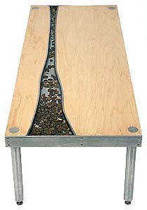
travelland. river. table.


Based on the theory that rivers are relaxing, Oliver Beckert thought it'd be nice to put one in your house. But, you know, a river can take up a lot of space, so where to put it? At this point Oliver kicked his feet up on the coffee table to have himself a think and...eureka! If the table has room for feet, he thought, it's got room for a river!

maybe. not.
Okay, maybe that's not what happened, but I'm not sure how else you get the idea to put a river in a table. However you come up with the idea, though, it's a pretty good one. Just looking at the Travelland River Table makes me feel relaxed, like my stress is just flowing away...

sticker. shock.
...until I see the $4,320 price tag that's attached to it. Ouch! I'm pretty sure I can buy an actual river somewhere for that price, and the plane fare to travel to it if it's not near me.

Note: Since I have to go look for that river, there probably won't be updates until Wednesday.

Wednesday, August 18, 2004

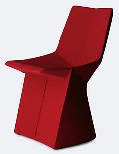
mars. chair.


The Mars Chair has a lot of angles on it, but none of them are right angles. That doesn't mean they're wrong angles, just that the chair has a unique surface geometry.

the. more. you. look.
All that edgy geometry makes the chair look different from different points of view, or so the copywriters say. They also make it comfortable to sit in, since the seat has a hollow for your, um, other planets, and the back is slightly inclined.

the. color. red.
Mars comes in a few colors, but if you get it in anything other than red you're a Philistine. I mean, really, a white Mars chair? Not happening. The good news is that while it costs NASA billions to go to Mars, you can have this Mars chair brought to you for just about $1,300.

Tuesday, August 17, 2004

asana. floor. lamp.


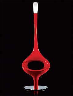
In yoga, Asana means posture, or seat. In Italy, Asana means weirdo chair, or weirdo lamp. At least the Asana made by Kundalini does.

extrasensorial. signs.
To clarify, the 6.5' tall Asana is both a chair and a lamp. Either separately, or both at the same time. It stems from the Kundalini philosophy to create things that are not only beautiful but "also and above all extrasensorial signs. Beings that refer to other dimensions and bring into our ambience a different energy." I guess they mean, things that look like they'd be at home on top of a teletubby head. I'm just saying...

fiber. color.
The main part of the Asana -- the part you can sit on if you like -- is made from a lacquered fiberglass attached to a stainless steel base. The lamp part is a "diffuser in Murano triplex blown glass." I'm not sure what that is either, but it looks cool.

bright.
The lamp part is bright because it's outfitted with a 250 watt halogen bulb. The fiberglass body is bright because it comes in colors like white, orange and red. There's also a black version that I guess isn't as bright, but that's still cool. No word on pricing or availability.

Monday, August 16, 2004

flos. night. owl.


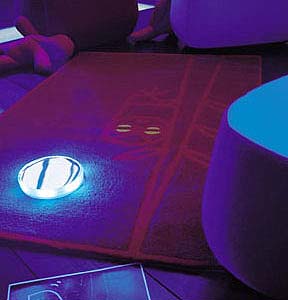
The Flos Night Owl carpet/nightlight might be a brilliant idea or just sort of, um, silly. It's a carpet with a pattern on it -- in that pattern is a circle -- on that circle you put an LED light -- at night that light lights up the carpet -- it also lights up the pattern -- and that prevents you from tripping when you go get a glass of water. So the theory goes.

i. liked. it. better.
I liked this better when I thought the light was built into the carpet and better still when I thought the light magically turned on at night. Now that I realize you just place the light on the carpet after you manually switch it on, it's not as cool. That doesn't mean it isn't cool at all, just that it's not as cool as I first thought.

tripping.
The very uncool thing about the carpet is that the light works great to prevent tripping, unless you actually trip over the light itself. Since the light just sits on the carpet, that makes it very trippable in my book. Maybe you light sleepers out there would see the light and avoid it, but like a moth to the flame I'm pretty sure my sleepy self would vector right in on the light and trip over it, or at the very least kick it under the bed.

neat. light.
Aside from those drawbacks, the light itself is kinda cool. It's got six LEDs in it, comes in amber and blue (as does the rug), and is rechargeable. So in the end I think I like the idea of the nightlight carpet, but not this particular execution of the idea. Which runs $595 by the way, and is part of the Baby Zoo collection.

Sunday, August 15, 2004

ventana. lamp.


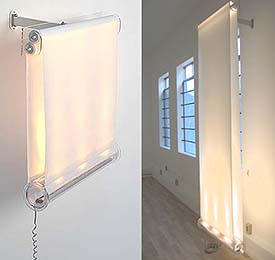
The Ventana is called a "lamp" but it doesn't particularly look like one, and you don't particularly need to use it like one. I mean, it is a lamp, but it's also a "light curtain" that can swing out and rotate sidewise to act as a room divider, or it can be used as a window treatment. I suppose if you work hard, you could get it to do all three at once.

versatile. ventana.
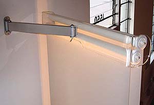
The "V" in Ventana surely stands for "versatile" because it can do even more things. The coolest thing is change size, from a relatively small 12" affair to a whoppingly large 9' long monster. Because it’s built somewhat like a roller shade, to make it bigger you just pull it down and so forth. The "light canister" at the bottom can also rotate 180 degrees to shine up so the whole thing works as an ambient light or down for task lighting.


sizing. it. up.
Since that isn't enough variety, you can buy the lamp in two sizes: 15" wide and 12" long, or 30" wide and 18" long. Both unroll to 9'. If you're wondering, the stuff that unrolls is a high-tech UV resistant mesh fiber that's fade resistant. Both versions use halogen bulbs and are available in white or silver. Online they run $400-$500 for the small or $600-$700 for the large.

curious. effect.
Although the Ventana seems to fall more on the gimmicky side than the useful side, I wonder what the effect would be if you used it as an illuminated window blind at night? It might be pretty spectacular from the inside and pretty I-don’t-know-what from the outside...

Thursday, August 12, 2004

sapien. bookcase.


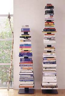
The Sapien Bookcase is a brilliant design that lets you stack books vertically instead of horizontally. Created by Bruno Rainaldi, it's primarily billed as a way to save space. But I think it does more than that. For me anyway, it's a more natural way to store books: in piles.

piles. and. piles.
When I'm not reading books it's pretty easy to keep them in traditional cases. But when I start pulling them out and thumbing through them (a cookbook here, a financial book there, a summer novel over there), there is always a "pile stage" where I might not be actively reading them all the time, but I'm not quite ready to put them away either. I think the Sapien is perfect for that.

10. 14. 9. 5. 50. 70. 180. 230.
There are a lot of numbers involved with the sapien: the small version has 10 shelves and the large has 14. The shelves can hold 9 lbs. each or about 5 books. That works out to 50 books for the small and 70 for the large. And finally, at Design Within Reach (where I saw them) the small costs $180 and the large $230.

Wednesday, August 11, 2004

vector. tv. unit.


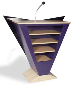
The Vector TV Unit from Axi sounds like a videogame system and looks like a podium, but it's actually something you put your TV on. Once the TV is on top, your DVD, VCR and other entertainment gizmos go in the shelf parts. (I think the bit that looks like a microphone is actually used to prop up a flat panel TV.)

attention.
What I like about the Vector is that while it looks fun and interesting all on its own, its shape leads your eyes to the TV. So when you want to watch the TV, you're not distracted by the stand, unlike some of today's monster entertainment units. And when the TV is off, the Vector is there, making a bold design statement in your living room (or wherever).

color.
Although I love the purple version (I'm in a purple phase right now), you can also get the Vector in any of Axi's colorful veneers, which include yellow, blue, red, orange and lime green, among others.

uncommon. style.
The downside to the Vector is that TV design is not up to its standards. With choices ranging from silver and black to black and silver, your TV has some catching up to do if it wants to be part of the the purple and lime green crowd.

Tuesday, August 10, 2004

performance. vip. club. chair.


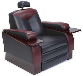
If you call a product the "Performance VIP Club Chair" my feeling is you better deliver something that lives up to that name. I haven't actually sat in these chairs, so I can't comment 100%. But based on all the other home theater chairs I've seen and sat in -- and I love home theater chairs -- these look about eight times better than most. They're from Irwin Seating.

stylin.
Home theater chair style is, for the most part, still in the dark ages. Typically they're puffy, squarish and have cheapo drink holders implanted in their arms. The Performance VIP has some puff and square to it, but it's sleaker than most and looks even better in a two-tone covering. It also has real wood tray tables, which are good not only for drinks but also popcorn and remotes.

head. above. the. rest.
What really tells me this is a good home theater chair, though, is the headrest. Sure, you want something that will support your head, but you also want something that won't block surround sound. The VIP has solved that nicely.

price. point.
I haven't found the price point for this chair, but if past experience is any help, I'd expect that point to fall between $1,500 and $3,000. Of course, if you have a home theater that's big enough to put a bunch of VIPs in, you can probably afford that.

bond. age. beanbag.


The first thing you notice about the Bond Age Beanbag is the soft black nubuck suede that it's made out of, right? Yeah, me neither.

yes. they. are.
Yes, those are chains attached to the Bond Age, and yes, that is a girl attached to the chains. Deliberately. As manufacturer Jucci puts it, with the Bond Age you can "either just lounge with your loved one or, with the addition of clever little accessories, indulge in a little gentle exercise!"

jucci.
I'm blogging the Bond Age not because I think it's the greatest piece of furniture in the world but because I couldn't not blog it once I saw it. I came across it while browsing the otherwise innocent (well, mostly) Jucci Web site, where the "designers are dedicated to producing innovative signature pieces to complement the modern environment." Of course they are. I never thought otherwise.

price.
The non-chain version of the Bond runs £875, while the chain version costs £945. I think your choice is clear.

Sunday, August 08, 2004

bulbcaps.


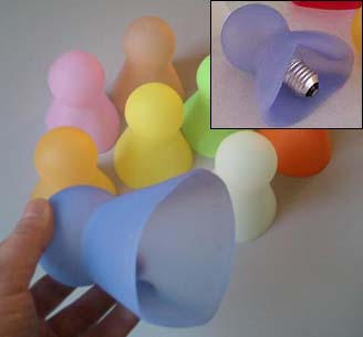
The Bulbcap is (you know it's coming) a bright idea. It's a little rubber sheath you put over an unsightly bare lightbulb to turn it into a slightly more sightly, slightly less bare bulb. It comes in colors, and can safely be used on bulbs up to 40 watts. (I'm studiously avoiding going for the easy joke here...I just want you to know that.)

simple. concept.
The Bulbcap is a simple but elegant concept. I wonder, however, how big the market for this product is, since I don't have many bare bulbs in my house and neither do any of my friends. But it's something I'd expect to see selling well at IKEA, so subconsciously I must think there are a lot of people who need these.

pricing.
I assume Bulbcaps are pretty cheap, but the only sites I can find them listed on aren't in English, so I can't swear to it. Also not sure what U.S. availability is.

Follow Up: These are carried in the U.S. by Friend, who say they only have a few left and they cost about $18.

morfeo.


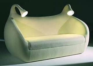
According to the manufacturer, the Morfeo couch owes a nod to Morpheus, the god of sleep and dreams. Dreams I presume because the couch is dreamy looking and you'll hopefully have wonderful dreams when you sleep on it, and sleep because the couch also unfolds into a bed.

aether.
I think they should also throw in a mention about Aether, the god of light, because of the wicked funky flexible lights on the Morfeo. These are especially cool because I'm always needing reading lights, and Morfeo's dual beam action means I have both sides of the bed/couch covered. When you don't need the lights for reading, you can just point them at the ceiling and you've got a couple of torchiers for atmosphere.

little. info.
I don't have a lot of hard information on Morfeo, like pricing or availability. I do know it's new for 2004, so hopefully we'll be hearing more about it.

weekend. web. updates.

Some cool Web sites I've added to the links section: Plushpod and Hive are well worth a visit, Steve pointed out that I didn't have a link to Design Within Reach, the name Lightology is fantastic but I wish the online store had a bigger selection, and the name TheMagazine.info is strange, but the store itself is wonderful (I wrote to ask them why they chose that name, but have not heard back yet).

FYI, suggestions for links are always welcome.

Thursday, August 05, 2004

mago. serving. trolley.


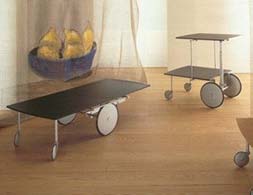
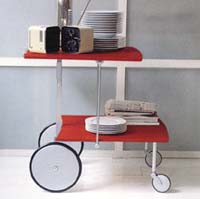
Sometimes I could use a serving trolley and other times I could use a coffee table, but no times could I use both simultaneously, due to space issues. Since I can't have both, I don't have either, but if I did, I'd also want them to look kind of modern but kind of funky. And while we're at it, I have a weakness for tables with big wheels, so...why not throw those in too?

raul. barbieri.
There's an Italian designer named Raul Barbieri who not only had all of these same thoughts, he did something about them. In 1992 the thoughtful Barbieri created the "Mago Cart," which I've pretty much already described. It's a serving trolley (a.k.a. bar cart) that can morph into a coffee table, it's both modern and funky, and it's got big wheels. And, bonus: It has small wheels too.


i. dream. in. color.
I never actually got around to thinking up the color part of my hypothetical troll-offee-able, but Barbieri did. The Mago comes in a lacquered black or red finish. Hm. Maybe I should have thought a bit about that, as I'm not a huge fan of red. Oh well. The metal bits are anodized aluminum, which is probably what I would have done too. Nice job Raul.

cost.
I'm thinking of a hypothetical price for my troll-offee-able, and it's not in the mid $700 range. Raul, do you hear me? Sadly, not.

Wednesday, August 04, 2004

the. magic. pouff.


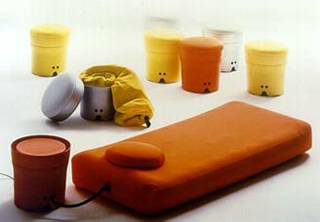
Some things you just don't realize you need until you come across them, like The Magic Pouff by Denis Santachiara. The Pouff is both an ottoman and a bed, depending on what you want it to be. Who knew such things existed?

inflatable.
Okay, it's actually an inflatable bed in an ottoman, complete with a compressor to pump the bed part up. And I really don't need one, but it looks so cute I want to bring it home anyway. The bed part doesn't look terribly comfortable, but that's something I'll let my guests worry about.

available.
I'm not sure if the Pouff is available in the U.S. or not. I've only seen it on some European Web sites, running about 275 euros.

Tuesday, August 03, 2004

lazy. lamp.


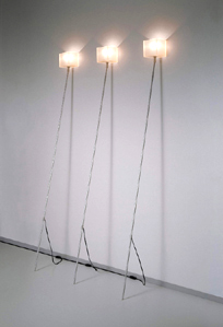
The Lazy Lamp from Chris Slutter is a cross between a floor lamp and a wall sconce. That makes it kind of perfect if you want a sconce, but you either a) don't want an on-wall kind with a cord hanging from it or b) don't want to cut into your sheetrock to add the in-wall kind. It's also kind of perfect if you want a floor lamp, but one that looks a bit unusual.

it. leans.
The Lazy is also called the Lean Lamp because that's what it does...it leans on your wall for support. The square top of the Lazy is made of rubber, and without a wall to lean against it just kind of flops around pitifully. Lean it against a wall, though, and it looks distinctive and stylish. I recently bought a Lazy and everyone who comes to the house admires it. So much that I'm probably going to buy another.


not. quite. perfect.
I love my Lazy but there are two things that would make me like it better. The first is if the cord didn't stick out about a foot up from the base of the aluminum pole (you can see this in the top picture). And the second is if the cord weren't brown, which doesn't go at all with the rest of the lamp. (Yeah, I could hack it with a new cord, etc., but ... nah.)

lovely. light.
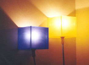
A quick note here about the light quality of the Lazy, which uses a 40 watt bulb. Because the rubber top is translucent, it gives off a nice, warm light that looks kind of candle-ish. And it comes in four charming colors: white, yellow, blue and orange. But since the top isn't covered, it also acts as kind of a torchier and illuminates a small area quite well. As far as pricing, it's not free but it's not outrageous. I found it at Retromodern for $195.

Monday, August 02, 2004

bouloum. chaise.


What could be more comfortable for the human body to recline on than a human body in recline? If that made sense to you, then you more or less understand the sentiment behind the Bouloum Chaise. It was designed by Olivier Mourgue in 1968 and named after one of his childhood friends (presumably someone he sat on and, if so, hopefully a comfortable someone).

characterful.
The Hive Web site where I found it describes the Bouloum as "characterful" and also describes how Mourgue took the seat with him when he traveled, photographing it in various "situations." What I take from that is not an intense curiosity about what these "situations" were (okay, I'm lying, I am curious), but the fact that this thing is apparently light enough to carry around. I.e. it's light enough to move easily. I.e. it probably does not way 10,000 lbs.

museum. piece.
Apparently I'm not the only who thinks the Bouloum Chaise is pretty freakin cool. After coming across it online, I googled it and found out it's on permanent display in the New York Museum of Modern Art. Deservedly so, I say.

owning. history.
Unlike most museum pieces, you can own this bit of history for just $950 (not the one in the museum, of course). Luckily that seems to include free shipping at most Web sites where I've found it for sale.

tipi.


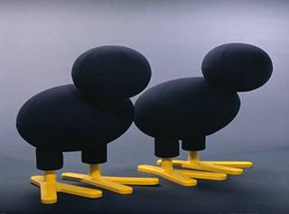
What do you get for the person who has everything, including a Pony? A Tipi of course. A Tipi is basically the same thing as a Pony, but it's not a Pony. Which is to say, like the Pony it's meant to be a seat, but not necessarily a chair. And like the Pony it's meant to be fun. But it doesn't look like a Pony. It looks like, well, a Tipi.

is. it. better?
Is the Tipi better than the Pony? Only if you think so. If you don't think so, than it isn't. Personally I like them about equally. The Pony was designed about 30 years ago, while the Tipi was designed just a few years ago.

is. it. cheaper?
The Tipi is slightly cheaper than the Pony as far as I can tell. Online it seems to run a few hundred dollars less than the Pony, which costs around $2,000. Out of my reach, but maybe that will tip the scales for some of you who almost had enough money for a Pony, but not quite.

Sunday, August 01, 2004

art.


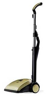
When you go to the ART Web site you'll see some pretty unusual vacuum cleaner images: there's one in a collector's case, another by an artist's easel, and a third by a couple in bed with a dozen roses. What's going on here?

art. as. art.
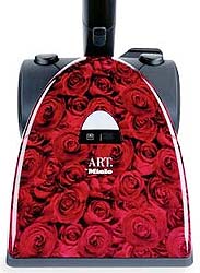
What's going on is that Miele has created a designer vacuum cleaner called ART, one that's supposed to look as good as it works. In other words, there's art behind ART (as well as cleaning power). Considering how most vacuums look, I think Miele has done a credible job. Not only does ART have a cool shape and a low profile, it also comes in some fun colors: Hot Chocolate, Black Mystery and Red Roses (pictured below).


video. art.
ART is so designer, it even has its own video. And I even watched it. It's mostly fluff, but it does show ART performing some interesting maneuvers that I wish my vacuum (Dirt Devil MVP, if you must know) could. The coolest thing is where the handle not only tilts but also twists.

the. details.
There's a bunch of vacuum-speak on the ART site like "1,000 watts" and "integrated universal floorhead" that I assume proves that ART picks up dirt reasonably well. Miele products tend to be pretty good, so I'll take them at their word. They also tend to be expensive, and the $399 for ART is higher than most vacuums I've seen but doesn't seem off-the-wall crazy.